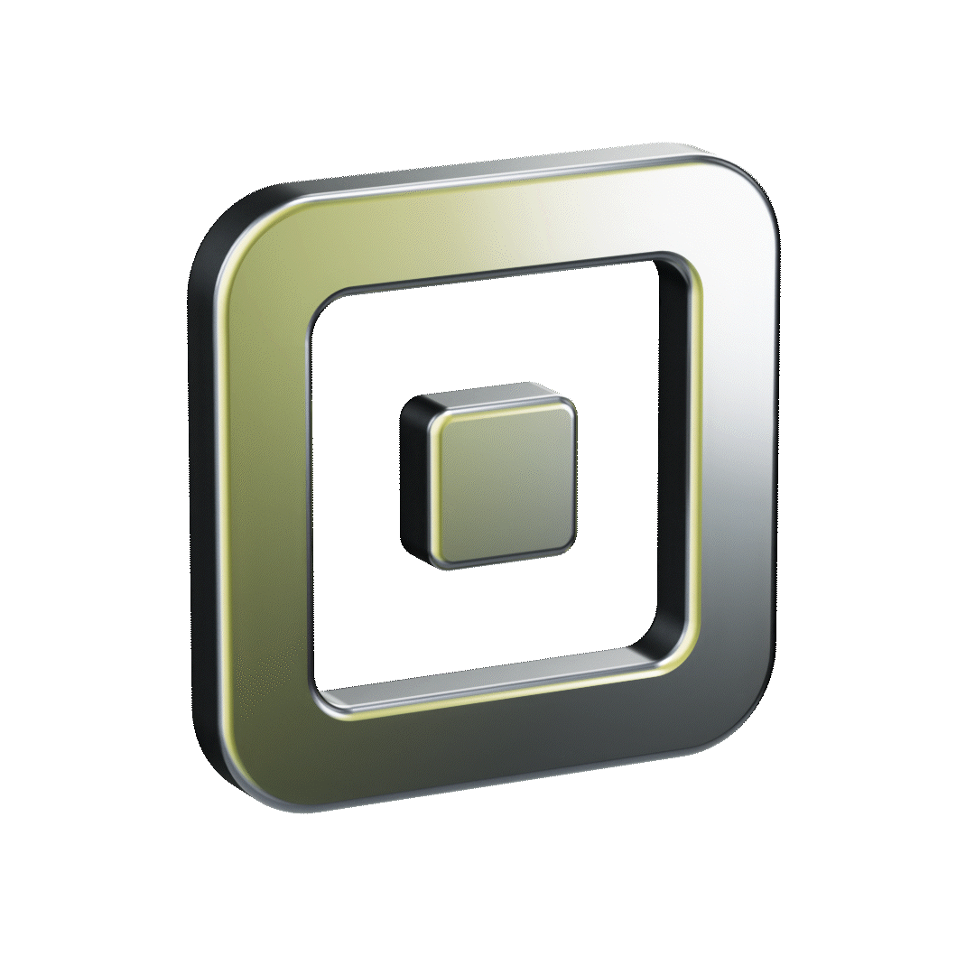
Square Developer Brand Refresh
After years of designing on a hodgepodge of brand styles, Square’s developer offering had grown more robust, but the brand lagged behind. Our audience was unclear, our visuals were inconsistent and outdated, and internally, we lacked shared design guidance for messaging and layout.
Over the course of 18 months, our small working group collaborated closely cross functionally, with Square leadership, and with external vendors, to define our audience, develop the first ever brand guidelines for Square Developer, and launch 5 landing pages, 4 of which were net new.
The resulting brand system distinguished up from our competitors, enabled increased efficiency and consistency across our team’s production, and later came to inspire 3 other teams at Square in their own brand refreshes.
ROLE: Art Director & Lead Designer
WORKING GROUP: copywriter, designer, ACD
COLLABORATED WITH: PMMs, UXRs, Developer Advocates, Brand, Product
DURATION: August 2022 – October 2023

The visual brand needed to be anchored to Square’s brand, but adopt unique qualities in order to appeal to our developer audience. We achieved this in 4 key ways:
Flip to dark mode
The vast majority of developers work in dark mode when programming, but Square’s brand mostly worked on white backgrounds (at least at the time.) Flipping our homepage to dark mode gives a cue to developers immediately that this place is for them.
Additionally, our secondary color palette is inspired by syntax highlighting color schemes, and was pulled from Square’s product palette, tying our content to Square’s while also retaining an independent edge.
Add a monospace cut to Square Sans
With similar logic as changing to dark mode, we also commissioned Colophon Foundry to create a monospace variation of Square’s eponymous brand typeface. The monospace cut was designed to be used alongside the rounder, wider display version of Square Sans, as well as the reading-friendly text version.
Adopt a witty, self-aware, and scalable tone of voice
In general, developers are kind of allergic to marketing jargon. They typically want to get the information they need in a direct way….but they also love finding a good meme along the way.
So we crafted a tone of voice the scales to these two realms — we’re intentionally straightforward when delivering informative content, but also playfully self-aware when there’s room for levity.
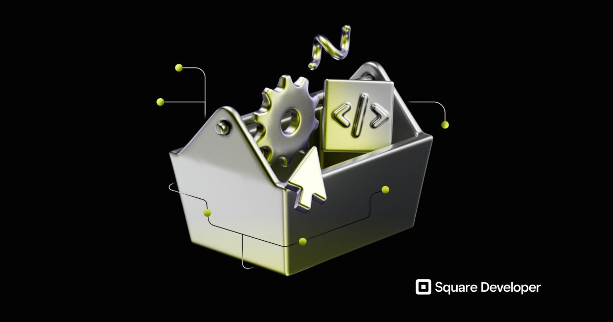
Create developer-oriented visuals
We worked with Square’s in-house studio to develop a set of static and animated “devicons” (developer icons) based on objects and ideas that a developer might encounter in their work environment both on-screen and off.
The sheen on each Devicon signifies an “upgrade.” That is, one can upgrade a seller’s experience using Square Developer. Similarly, a dev can upgrade their own business by monetizing on the platform.
After defining the brand, we began the process of refining our audience designations and content strategy.
Ultimately, we built 5 landing pages — one for our developers, the goal of which was to get them quickly to docs, and 4 for our partners, each of which prioritized conversion.

These updates to both the visual brand and our strategic messaging established Square Developer as one of the most future-facing teams within the company, and informed other teams’ approaches to design and content strategy going forward.


By the numbers
5
new pages launched
(4 net new)
30
devicons designed & animated
89%
positive response rate
for dev homepage
18 months
of work from
kick-off to GA launch
30%
increase in conversion between developers and partners
8
users interviewed
during concept development
a bagillion
lessons learned about
rebranding a team
96
versions of the dev homepage
wireframed